- About
- Store
Loading...
An analysis of omentejovem's new and intensely colorful artwork
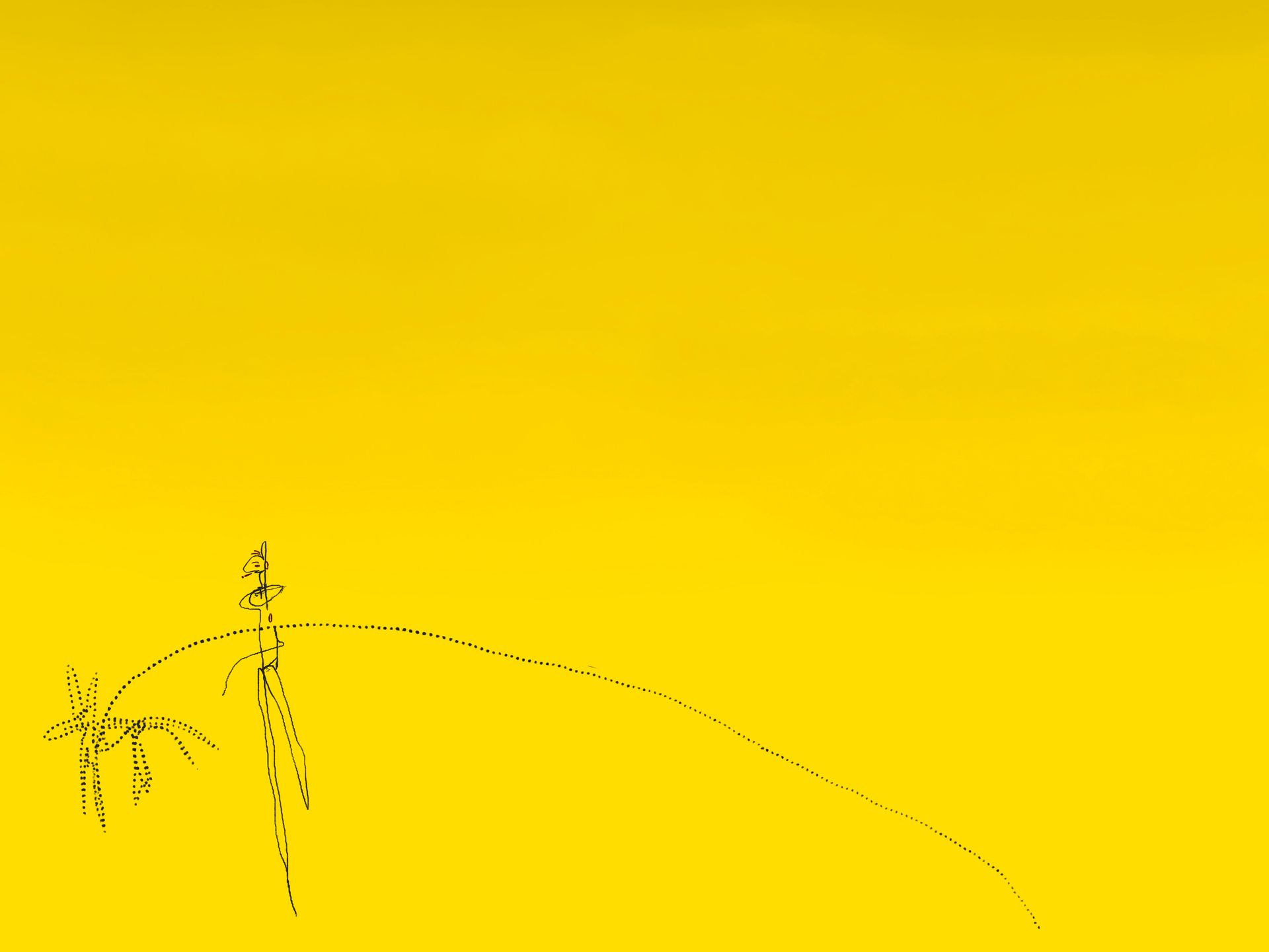
When I first spoke with Thales about the new artwork he was creating, he told me that I didn’t expect: “I drew a dog.” I’ve known the Brazilian artist as a cat lover and not a particular fan of the other common pet. “It just happened and I actually also don’t know why, but I decided to just explore the piece further,” he added.
A few months later the result is omentejovem’s new 1/1, titled My Dog Has a Long Leash. He thought it would be interesting to use ‘my dog’, as if he did have a four-footed furry friend that he walks everyday. The opposite is true, and thus it’s all a metaphor. Of what, omentejovem isn’t really descriptive about. He just gave me a few thoughts, but wants me and you to find meaning in our own ways.
What he did give is a subtitle: Don’t let the dog guide you. And in his newsletter, he explains some of the artistic choices he made: “After the first iteration, I drew the leash and the dog using pointillism lines. This was a way for me to symbolize something that isn't real, but that is holding me back. The leash is long, but it's still a leash.” For him, this makes the limit we as humans have in our minds visible. The thoughts, feelings, choices, and directions we let others or ourselves define or decide with no good reason. In a physical sense we don’t have that constraint; we don’t walk around with a collar that’s only x meters.
Mentally though, there is a version of us walking around that makes us question our actions and then do differently even though our intuition thought otherwise in the first place. That’s the dog with the long leash. It has some bandwidth, but in the end it’s still a constraint. Not following your gut feeling but letting ‘the dog’ (aka rational reasons from others or your own negative side) guide you. The artist firmly said to me: “We should guide the dog instead.”
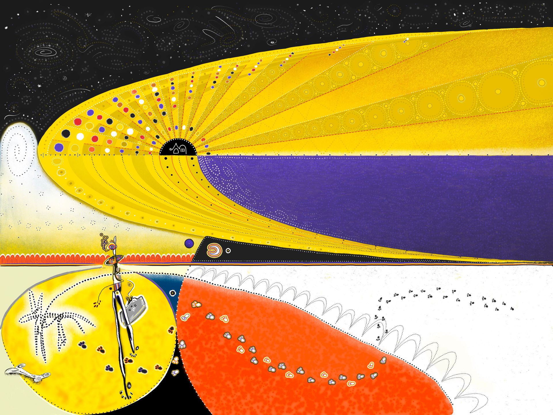
So there it is; it all started with an imaginary dog. The work was completely yellow with black-and-white line drawings at first, but got a lot of (omentejovem’s signature) colors at the end. In this piece, the yellow–purple combination is particularly appealing. In general, purple and yellow work well together because they are so-called complementary colors: direct opposites on the color wheel. Just like red–green and blue–orange. That opposition produces both tension and balance; the yellow seems brighter and the purple seems stronger. Here’s a little breakdown on complementary colors: when two of these hues meet, they heighten each other’s intensity. Our eyes try to reconcile the clash, producing a subtle vibration at the border where they meet. In painting, this creates an almost physical sense of light. Someone who was particularly sensitive to this effect was the famous Dutch painter Vincent van Gogh (1853-1890). He wanted his colors to “sing”, as he told his brother in a letter.
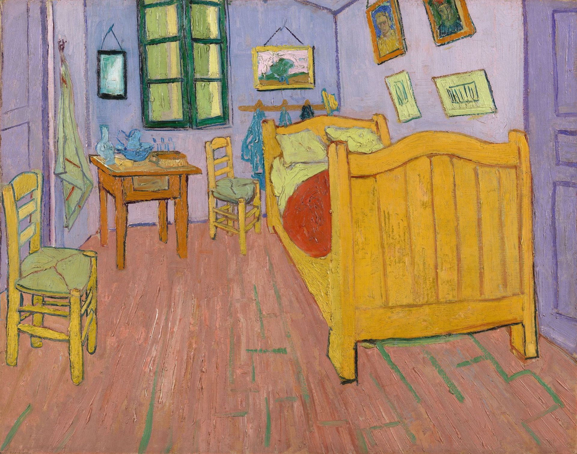
Purple and yellow are one of the strongest such pairs because their wavelengths are at nearly opposite ends of the visible spectrum – yellow being near the long, warm end and violet near the short, cool end. The result is a natural push-pull between warmth and coolness. Van Gogh’s The Bedroom (1888) was originally painted with a carefully considered palette of lilac-purple walls and a dark yellow bed plus other furniture (elements). It gave the work harmony through contrast. Sadly though, the pigments Van Gogh used were chemically unstable: the lilac and mauve tones on the walls were created with red lake pigments that have since faded. Over time, the reddish component deteriorated, leaving behind the blue base of the mixture. As a result, what were once purple walls have shifted toward bluish tones, and the whole chromatic balance of the room has changed.
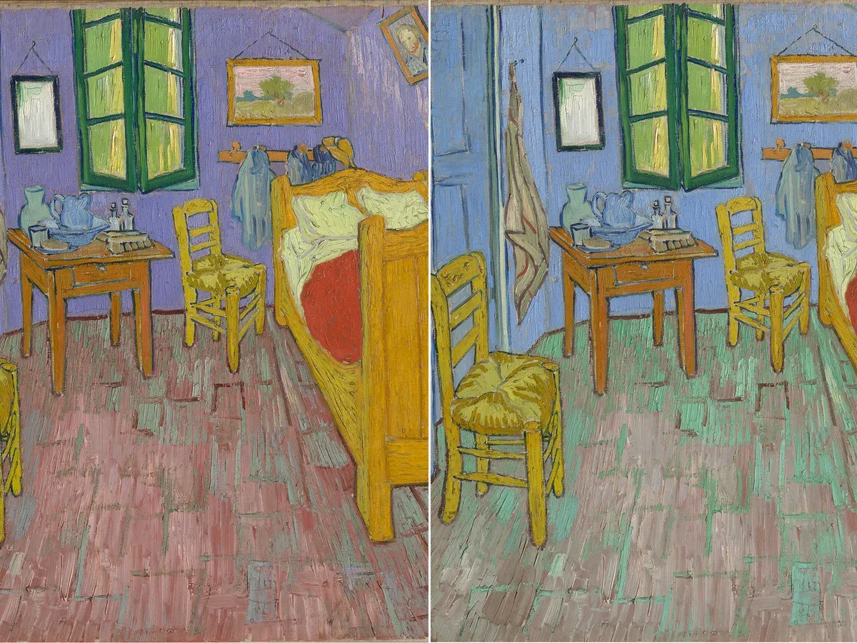
Scientific analyses – such as those done by the Van Gogh Museum – have digitally reconstructed the original color scheme, showing that the walls were not the cold blue we see today. When restored virtually, the room feels far softer and more cohesive. That’s your proof for how color schemes, their effects, work. So back to omentejovem, the yellow and purple relationship in this artwork works so beautifully because it carries that same optical and emotional tension that Van Gogh explored.
Below the huge, radiating yellow field curving toward a deep, almost weightless violet band, the orange and white create a more ‘earthly’ rhythm. For me, the orange feels grounded and bodily compared to the ‘ethereal’ upper section. The small black dotted lines in the shape of moons (resembling the big yellow shape) link the upper and lower halves like constellations or migratory paths. The red-orange next to the yellow strengthens the sense of heat, while the cool white zones keep the composition ‘breathing’, I’d say. And then there’s the black which isn’t just a background. In my opinion, it sort of holds the chromatic forces together. Omentejovem used it decisively – around the yellow circle at the bottom left, for instance: it makes the color appear to glow from within.
When I started to write this analysis, I didn’t set out to focus on the color scheme this deep. But that’s how it went. Apparently the colors spoke to me vividly, and Van Gogh immediately came to mind. And instead of ‘simply’ using contrasting complementary hues, omentejovem here staged a dialogue between temperature and mood, I feel: cosmic yellow and violet above, earthly orange and white below.
With the transitions being fluid, it gives me the sense that the entire image could be one cyclical movement: sunrise to night, expansion to rest. How much is ‘the dog’ going to guide you in the next 24 hours? Where’s your mind? At ease? Torn? How much space do you feel to go your way? My Dog Has a Long Leash asks me all of that, with the knowledge that there’s always a coexistence of opposites. It’s okay if the leash is a bit shorter some day. You’ll guide you in the end.